HAPPY FIRST BIRTHDAY TO A FULLY PUBLISHED “ETERNITY’S IRYS”!
Printing with Amazon has been a mixed bag. I can’t exactly not use them due to cost effectiveness, but quality can vary wildly. The most common issue was the covers appearing off kilter in some what. The spines would be at an angle, the front would be off center and this was all made so much more obvious with the presence of the frames offering straight lines with which we could easily see the discrepancies.
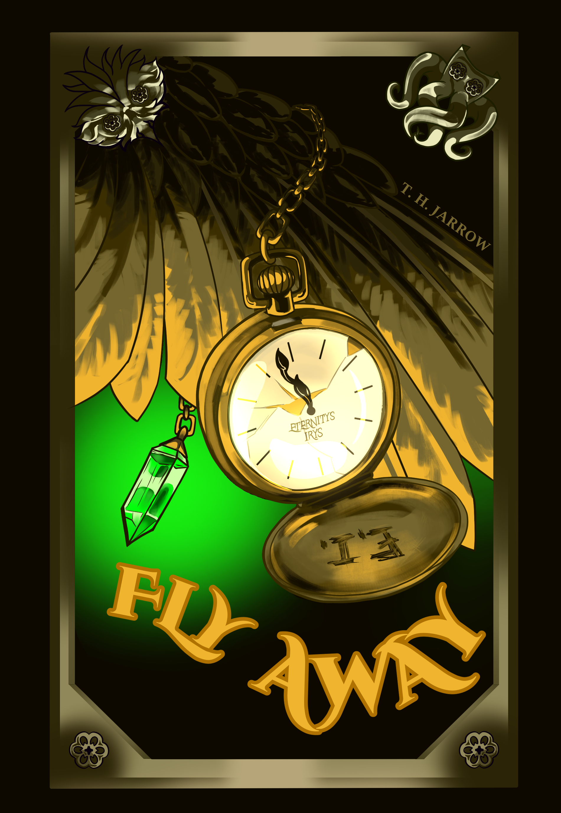
So a thing happened wherein Rhett and I readdressed some of the obstacles that made the covers difficult to print consistently. Mainly the frame on the spine and, to a lesser extent, the frame on the front and back. My initial approach was to remove the one from the spine so no matter how “off” the printing was, there’d be no straight lines to make it obvious. After that, Rhett entertained the idea of removing the frames entirely to avoid ALL straight edges that might make misaligned printing obvious.
In extending the wing on “Fly Away” to account for the removed frames, we kind of slipped into an aesthetic shift. The darker, gloomier approach I’d hoped for from the start began to manifest. This resulted in a what was essentially a complete overhaul of “Fly Away”‘s cover.
Improved tools and greater experience lead to the masterpiece above. I am so pleased with the result. It hits all the notes I could ever want from a cover for my book.
But it didn’t stop there!
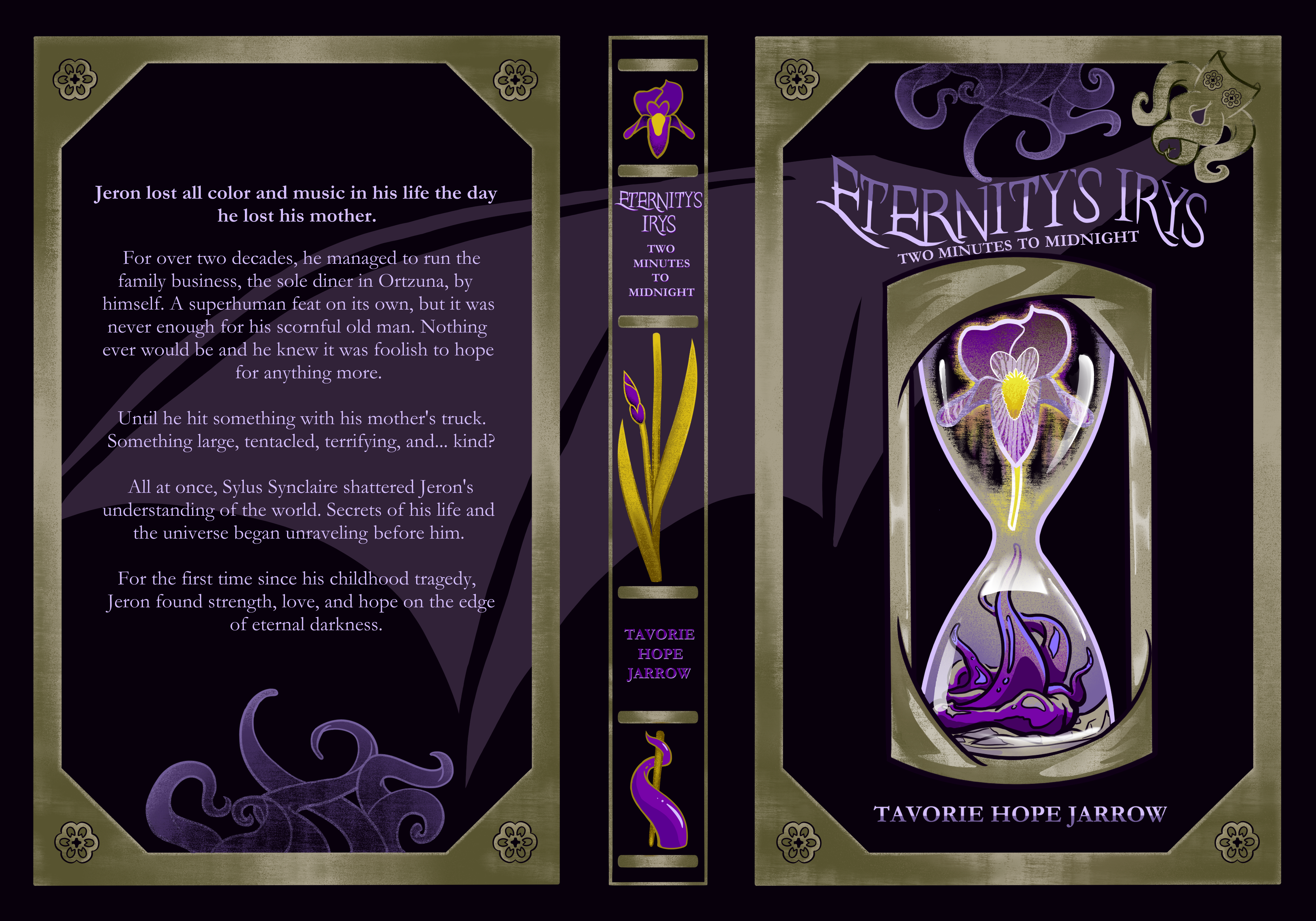
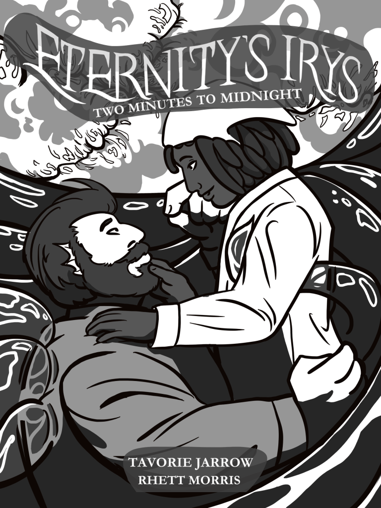
Immediately after, Rhett took on redoing “Two Minutes to Midnight” to match this new aesthetic.
AND I AM SCREAMING!
“Two Minutes to Midnight” now embodies EVERYTHING I could have ever wanted from it. Rhett’s absolutely STUNNING work absolutely gives my stories the gorgeous covers they deserve.
Anyway, this is now the trend for all covers going forward and I’m so excited.
Other News
The epilog for “Fly Away” has been somewhat extended and is at about the half way point of line art. We still don’t have a definitive release date, but I’m certain it’ll be sometime early next year.
First pass of edits are complete and now I have to sync the manuscript with Atticus to upload to Amazon for a fresh author copy featuring the new cover!
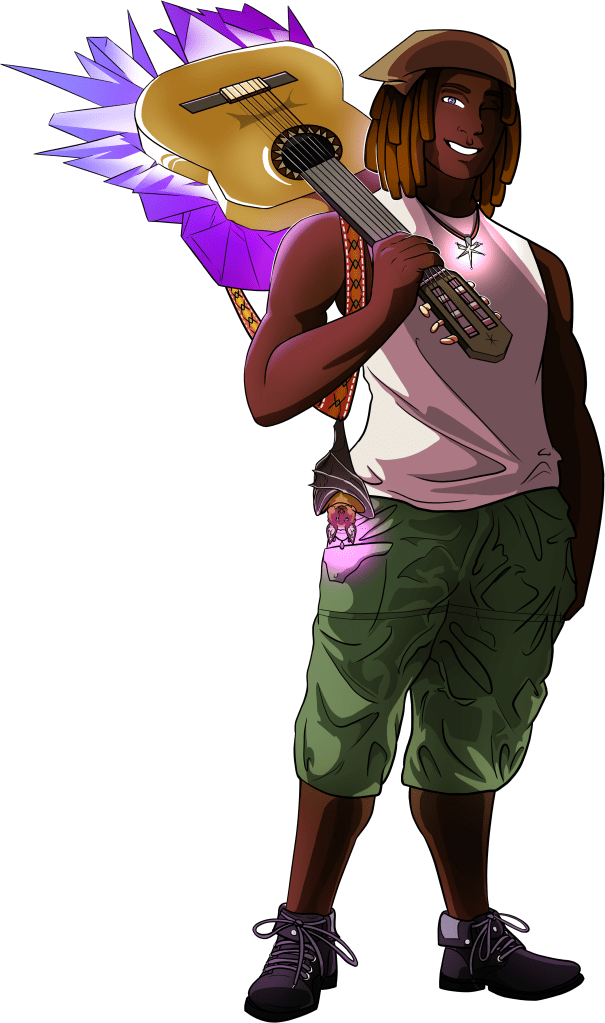
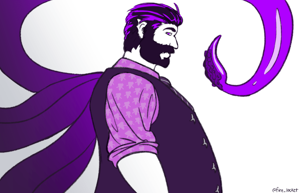
To start off the year, we’ve gone back and remastered Sylus’ and Jeron’s designs to better match their lore-accurate descriptions!
The “original” designs were something of a test for the illustrator as well as myself to see how my descriptions translated. Since then, they’ve become much more familiar with these characters in both personality and appearance. The result was a revisiting of their designs.
As always, all artwork is done by Rhett Cameron Morris (@firelocket on Instagram)
Jeron
BeforeAfter
I knew from the start we already had a very good grasp on Jeron. He does have quite a bit more going on and looks absolutely fantastic fully rendered. Left was definitely a good place to start and it’s very clear that it lead to the final result. Jeron now features his guitar in melee mode and his bat familiar as well as his Sion’Dri cross. He’s wearing his very functional and minimalist casual attire featuring his mother’s old boots she handed down to him at some point.
He is exactly how I envisioned him.
Sylus
BerforeAfter
Well, this was a bit more of a complicated process. Sylus has long been a design nightmare for me. Back when we were working on the illustrations for “Two Minutes to Midnight” he proved to be my biggest point of issue (Rhett was very patient but I know I was reaching critical pest levels at times) Mostly because of his origins as a vessel and less a truly independent character. As a personal note, I did go through some stages of grief realizing how far he’d escaped my control. I struggled to accept what I was looking at. I struggled to accept that he wasn’t just in my head anymore as an amorphous representation of my own struggle with representation. Granted, he always looked a certain way, but unlike Jeron, he was more a collection of concepts than a fully put-together design. I think my beta-readers started forcing me to really think about his appearance in a more solid way.
Anyway…
Sylus features finned ears, shark-tooth underbite, a reverse angler light, and, of course, one of his many signature tentacles. He’s sporting his “casual” attire. The only thing he’s missing to be “formal” is his jacket. He’s holding a glob of the inky acid he uses in combat.
Final Thoughts
Rhett did an amazing job and I couldn’t be happier. They had to listen to me cry about Sylus and have a minor mental break when I realized I had to separate myself from him after 7 years.
Now that their “Two Minutes to Midnight” designs are complete, we have the groundwork to build on with future designs. As of the end of “Two Minutes” and the beginning of “Flyaway”, Jeron is already markedly changed. Sylus will be receiving an overhaul in “The Devil Wears Violet” (working title for book 3).
Remaining designs I’d like to get to down the line: -Secondary Characters -Void Spawns / Bestiary -Other Critical Voidal Entities -Sylus’ “Lord Form” -Sylus’ “Final Form” -Jeron’s “Final Form” -Jeron’s Familiar’s True Form (she’s a bit more than just a little bat)
The next immediate project is the cover for “Flyaway”.
After that, there’s a massive project that will be undertaken in lieu of illustrations for “Flyaway”.
We had some issues with Sylus’ face, but I think it was all in me not used to seeing him in a pose that offered more than a profile. It still feels a bit strange to see his face fully, but I know we got it right.
As always, thank you to @fire_locket for their artistic prowess and willingness to work with me on my beloved project!
*There may or may not be a small something something in the works… We shall seeeee…
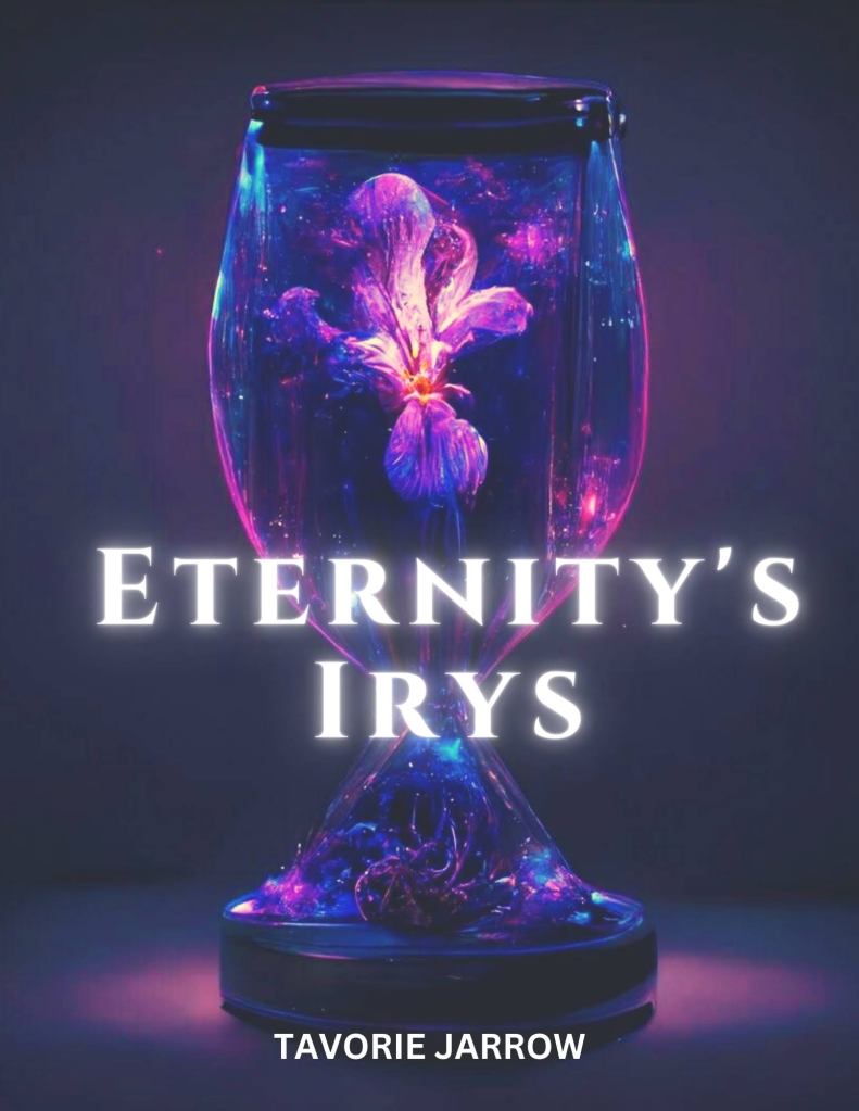
Behold! The second full-page illustration for the print versions of “Eternity’s Irys”!
Apologies for the belated update, but it honestly slipped my mind even though I’ve been plastering it everywhere because just look at it!
@fire_locket strikes again with their crazy skills. I love how in love they look. It just warms my heart every time I stare at it.
Additionally it was with this illustration that we realized I’d given Rhett the wrong page dimensions. The result was just a little more arting on their behalf and NOW we finally have full bleed images!
Since I was so darn late to post this, have a teaser for the third, and final, illustration:
It’s not even done, but I love it. Again with the body language! I always want to say Rhett is talented, but its all hard work, practice, and developing skill. It’s not just talent, it’s effort and understanding the subject matter to an amazing degree.
If all continues apace, the third illustration should be done by this coming Sunday! After that, we have some touching up to do and then we should be all set to get some physical copies for selling come October!
To say I’m excited is an understatement. I know I’ve said it before, but I’m going to say it again. This whole project has become a dream come true and I couldn’t be more grateful to everyone who’s helped me get this far.
Stay tuned for more updates and maybe a way to preorder if you’re so inclined!
I have come today to proudly introduce the world to the lead character and voice of Eternity’s Irys. You’ve known him by name for a while now, but now you get to meet him in person.
Jeron Miles in all his full-color glory by @fire_locket
It’s a bit of a leap in plot to call him an Archon, but it sounded good so I went with it.
This rendition comes from the first half of the book as Jeron grows and changes quite a bit by the end, but for spoiler reasons, we’ll keep it simple for now.
He was born with Voidsight allowing him to see things most people cannot. In Qalian, he’s a what the called a Dalafaem or Veil Piercer. This means that he already had an aptitude for voidal magics.
Upon meeting Sylus, he was able to tap into his innate ability and manifest it as offensive and defensive spells in the form of music played from his mother’s guitar. Strangely enough, the guitar doubles as an actual ax when more close quarter combat is unavoidable.
He’s come a long way from being a secondary character and a mere friend of Sylus’ to being the narrator and calling the rotund Voidlord his boyfriend. I firmly believe he was always destined to be the true catalyst of the tale and I’m so glad we finally made it to this point.
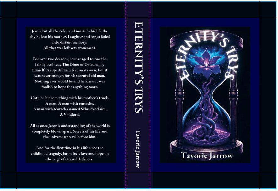
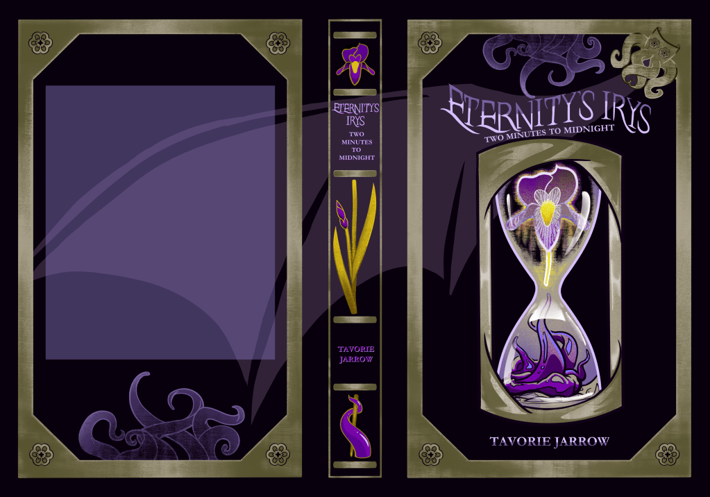
As you may have seen on social media, the official cover for “Eternity’s Irys: Two Minutes to Midnight” is now complete.
But how did we get here? A lot of work and effort between myself and (mostly) my illustrator, Rhett (@firelocket).
But what does the progress look like? How far have we come? That’s what I want to archive with this post.
Let’s start from the very beginning.
1: The Proto-Cover (2018)
Behold! The proto cover I made at the very beginning of the project. Why is the tentacle green? What is the brown thing? (It’s an antler) What am I even looking at? All excellent questions that have since been rendered moot with the current iteration. However, this comes from a time when I wasn’t being fully honest with myself. Still love that background image though! Used to have it plastered everywhere on the original site.
Honestly, I cringe at this version. It comes from a very misguided point of view and the design is just… awful.
2: A Second Attempt (2019-2020)
Another monstrosity by me! Hand drew all that stuff besides the stock silhouette. It still has a soft spot in my heart.
3: The AI (2022)
So, this image was made with midjourney. To me, I saw it as the closest I’d ever come to a relevant cover. Obviously you can see a lot wrong with it, but further toying only made it worse so I clung to this pretty tightly for the longest time. It was the first time I could visualize the concept of a cover for the book I’d worked so long and hard on.
Text was added by myself.
4: The AI: Round 2 (2023)
My brother made this image with some AI program. It’s better than the one I made, but it’s still problematic due to its origin. Still, it became the baseline for the direction I wanted to take a real cover if ever I got the chance to make one.
It was also the first cover to ever be printed.
Text was added in post.
5: The Official First Draft
The first sketch by an actual illustrator! I was skeptical of the gold and purple motif even though it’s canon to the book, but we ended up sticking with it.
After we went over a bunch of book covers and how I felt about them as well as referencing that last AI image, this is where we ended up. This is true beginning of our journey.
As you can see, there’s also a little illustration that didn’t make it to the end. We decided to take additional artwork into the book.
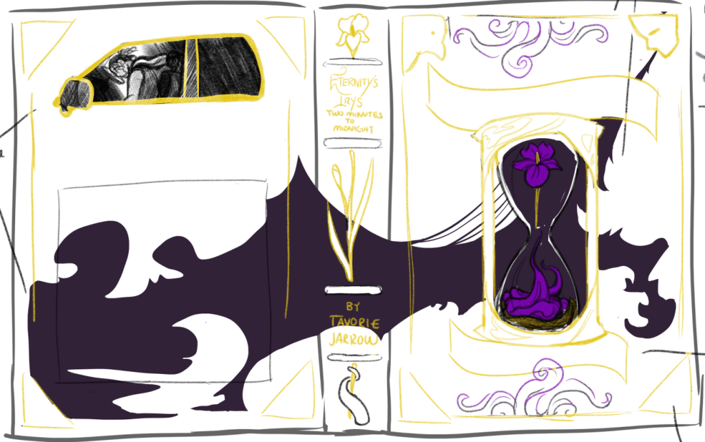
6: Behold: A Frame!
Some more refinement and a more established direction. I’d fallen in love with Rhett’s impromptu spine design and, while it’s unconventional and might not be the best direction, I pushed it.
We were going to put the subtitle on the hour glass, but man did that not end up going well in the end. I like how we resolved it in the final draft.
You can also still see a scroll on the bottom. That’s where my name was going to go, but we ultimately scrapped the scroll idea entirely.
7: Shading!
We spent way too long trying to realize my idea of making the mask look crystalline. The burnishing effect on the screws and frame were actually a happy accident.
Also worth noting is the smoke now has a definitive form. This is very very important.
8: The Final Form!
TADA!
Still needs a blurb, but here it is! The final cover for “Eternity’s Irys: Two Minutes to Midnight”. This is what you’ll find on shelves, should it ever get to them.
I won’t lie, at first I found myself detaching from it. It was so hard for me to accept that this was it. This was the one thing I never thought I’d ever have no matter how much I wrote, no matter how much I edited, I would never have a cover. Especially not one actually created exactly how I wanted it to be.
I remember going on Fiverr. I remember shopping bulk production sites. I remember googling assets and considering doing it all myself to avoid publishing anything with AI. I was about to accept that AI cover, even though I didn’t want to, but in a last ditch attempt to do something I actually wanted to, I made a Facebook post. Rhett reached out and the rest is now history.
The more I look at it, the more I show it to others, the more I love it. The more I can come to accept that this is, in fact, my cover. What a wild concept I thought I could only dream of.
It is currently in the hands of my publisher (brother) and I should have a dummy copy in a few weeks. I can’t wait to hold it all over again.
Other Things of Note
Beta readers are about half way through and are making some fantastic critiques! We’re aiming for their pass to be completed by the end of the month. I’m implementing their suggestions as they pass them along. It’s been an excellent experience and another thing I never thought I’d have. I’m so grateful to them, I was dead set on being the only eyes to look at it before it hit the wild because I was too afraid of it being torn to pieces like a previous version had been. That would have ended me.
But that’s not how it’s gone. Not at all. And I’m crazy grateful for that.
October deadline seems to be holding strong. Once the beta read is done, I’ll finish polishing, see if they’d be willing to check it again. All that would remain is the internal illustrations and then… Well, maybe one more dummy print before it goes live.
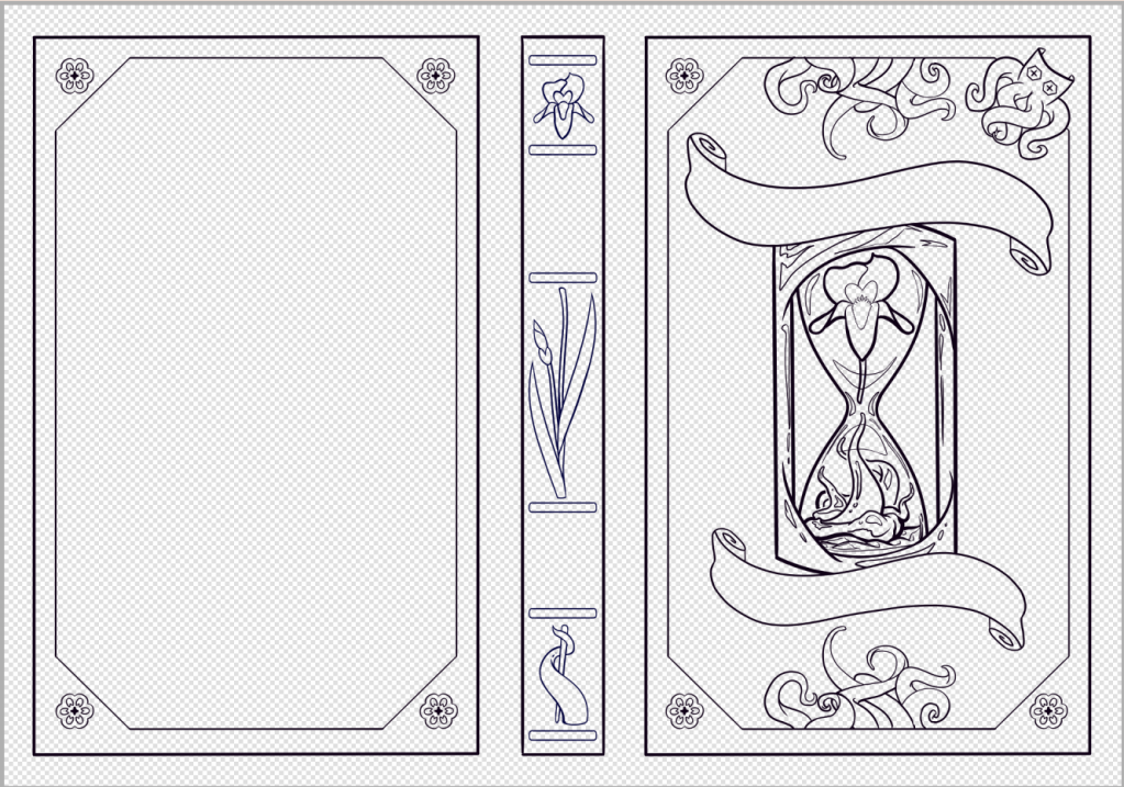
I love it so much. I’m so happy to see all the line work coming together. Rhett’s doing an amazing job and I can’t thank him enough.
With the bulk of the outlines done, that really just leaves details, colors and shading. I shouldn’t say “just” because that’s still an awful lot of work. In fact, I think that’s the hardest part of any project so let me just rescind that “just”.
We’ll also be ironing out text closer to reveal time.
But yeah. There it is. The bones of my book cover!
In other news!
I swore this was going to be my last editing pass, but something happened. I reworked a major plot point to remove some clunk I was struggling with. Which resulted in an entire rework of the ending, but that’s a good thing! I was really afraid of end being the weakest point of the entire book and, as it was, I sincerely think it was. It’s been messing me up for a while, but I finally have a clear path forward.
Things to look forward to!
Full cover reveal coming next month! I don’t know how much of an event it’s going to be, but I hope to make something of it for Pride Month.
Speaking of Pride, I don’t think I’ll be doing daily shorts again. A lot of my focus is currently on getting the book out the door by October. I might get a handful of shorts if any, but no promises.
All in all, it’s going well.
Here’s an updated timeline of events:
I’m still in a bit of shock that this is all actually happening. That I’m actually going to publish a book and its going to have an awesome cover AND there’s gonna be illustrations. I’m just floored by the thought of how amazing this whole thing is gonna be.
If you’re maybe a little excited, too, stay tuned for more!
Until next time! \o 🦑💜🦇 ^This is finally gonna make a whole lot more sense
Update! (5/10)
There’s been some developments and rather than make a whole new post I’m just gonna put it here!
After two meetings with my illustrator, Rhett (@fire_locket on Instagram), we concocted a rough draft of the cover!
Behold!
The beginnings of an original cover! Zero AI! All hard work and collaboration between humans!
So, were did all this come from considering the only element from the original AI design that carried over is the hourglass?
Well I’m so glad you asked!
For our first meeting, I gave some samples of covers I liked and didn’t like. Rhett was very receptive even though I didn’t think I was saying anything even remotely intelligent.
They took whatever I’d blathered on about and came up with two very strong designs. We ended up doing some mixing and matching as well as a bit of color theory.
For the longest time, I was dead set on just replicating the ai with a human hand, but Rhett pulled out all the stops and made me see the light of details. Every element serves a purpose and I am delighted.
SPECIAL SPOTLIGHT ON THE SPINE! I NEVER thought about doing anything interesting with the spine. Title goes there and that’s it. Rhett just made that happen and it’s staying.
The back is also pretty special. We’d discussed doing a little something something on there from the beginning. That rough outline is a hint as to what it will be. No further elaboration will be given.
Overall, the cover has gone from something stark to a more grimoire aesthetic and I couldn’t be happier.
Rhett’s done an amazing job thus far and I can’t wait to see the final result!
Speaking of, cover reveal (and maybe pre-orders 👀) will be coming in June! Huzzah! Finally doing something for Pride Month!
Stay tuned for an exact date if you’re interested!
If you want something to read in the meantime, the site is FULL of shorts that can give you a good idea of the world and characters of Eternity’s Irys. Especially the main boys, Jeron and Sylus.
On an additional note, the paperbacks for editing are finally under way. Something got held up with the printer and we didn’t realize until kinda late on. Should have those by the end of the month!
Bonus BERK for getting this far:
A spoiler literally no one will understand, but I love him all the same.
That’ll be all for this very tangible update! Progress is being made!
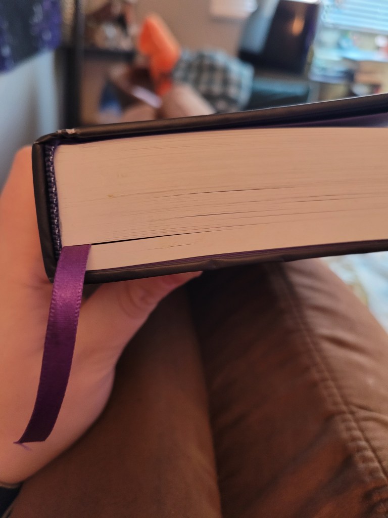
Earlier today I finished reading the entire physical copy of my book and it went so much better than I expected. I really thought it still needed a lot of work, but besides some small things, minor formatting issues, and a retooling of the literal last chapter, I think it’s damn near finished.
As you can see, the book’s been through some stuff. The dust jacket is in my commuting backpack and the hardcover has definitely seen better days, but it’s been places. It’s been to work, cafes, bus rides, home…
Every time I open its pages I find myself enamored with it all over again. I flip through the pages to remind myself that this is very real.
I wasn’t sure what to do with myself now that I was done combing through the physical book so I decided to just get to work transposing everything into the master file. Of course, after ignoring me all day, Zucca decided now was the time to get in the way.
I think once this pass is done, I’m going to see about obtaining some cheaper paperbacks and going through it one last time.
Other things going on in the background:
I’m trying to obtain permission to use the mandala artwork in the official publication. It’s up to the artist if they’ll allow it. If not, I’m going to see if I can commission something custom from the same artist. If not again, then I’ll have to go back to the drawing board with page artwork.
The cover art is on a bit of a backburner at the moment. Valentines Day, a holiday I don’t really care for, but its an excellent excuse for cute artwork of the boys, is approaching and said artwork is already underway.
I’m still aiming for a June 2024 release and at this rate that should still be very possible. I keep saying it as a kind of affirmation to remind myself that I’m not insane by setting a deadline like this.
Still feels incredibly surreal that I’ve gotten this far after all these years. I might finally be able to call myself a real deal author someday soon!